New Issues
Are you more of a Rabbit, Tiger or Ox?
I don’t know about you, but one of my guilty pleasures is reading my daily horoscope in the hope it will reveal what my future holds. Today’s was scarily accurate, as it claimed I would excel with some personal writing and here I am penning this blog – I hope you enjoy reading!
But regardless of whether you’re a staunch zodiac reader, or a firm believer in taking fate into your own hands, I don’t doubt that we’re all familiar with it and could probably rattle off our star sign when asked.
But perhaps lesser known in Western culture is the Chinese Lunar Calendar and the 12 legendary animals that represent it.
The Chinese Lunar Calendar
More commonly known as the Chinese Zodiac, it is believed the Chinese Lunar Calendar begun around 2600 B.C. and is related to the worship of animals in Chinese culture. Legend has it before departing to the next life, Buddha asked every animal on the planet to comfort him and the twelve animals (including the rabbit, tiger and ox) that responded are now honoured in the lunar calendar that spans 12 years – one animal for every year.
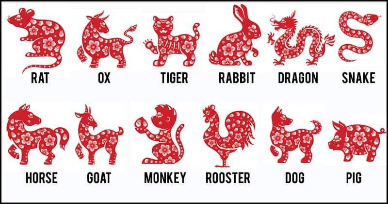
Much like the Western Zodiac, your lunar animal sign depends when you’re born. And people born in specific lunar years are believed to have certain personality traits and characteristics related to their animal.
Turns out I was born in the Year of the Sheep – so I’m creative, compassionate, and friendly. I’d say that’s fairly accurate!
The incredible popularity of Lunar Coins
For over 40 years Mints from around the world have celebrated Chinese New Year with Lunar Coins. These issues have turned in to something of an international phenomenon, to the point where the lunar theme is the largest ongoing coin programme on the planet.
Most prestigious mints have a lunar series, including Australia, Canada, and of course our own Royal Mint here in the UK. With each selling millions of ounces of gold and silver coins each year inscribed with the year’s relevant lunar animal.
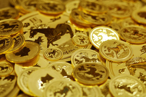
Collectors will snap these coins up for a variety of reasons. Some collect their own lunar animal, because they like the personal connection, others will collect a particular specification because it’s especially limited. Personally, I find they also make great birthday gifts for obvious reasons – my friends love them.
The Year of the Ox
The 12th February 2021 will mark the Chinese New Year, and with it the next lunar animal will be celebrated – the Ox.
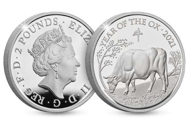
The Ox is the second animal in the Chinese Zodiac, and people who are born under the sign of the Ox are thought to be dependable, strong, and determined. Oxen are also notoriously hard-working and live long, fulfilled lives.
If this sounds like you the odds are that you’re born under the sign of the Ox. And this year your lunar animal will be celebrated on lunar coins all around the world.
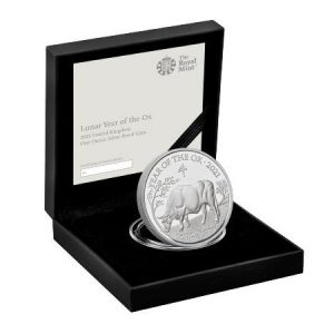
What’s more, The Royal Mint has just released their brand new Year of the Ox range, including what’s perhaps the most sought-after specification of all – the 1oz Silver Proof Coin.
If you’re interested…
You can own the BRAND NEW Royal Mint Lunar Coin TODAY – the 1oz Silver Proof Year of the Ox coin.
This coin is sure to be the most sought-after yet because not only is the 1oz Silver Proof a key specification for collectors, but last year’s coin completely SOLD OUT! In fact, previous issues in the series with far higher edition limits have also sold out, so we don’t expect to be able to offer this latest edition for long.
Click here to find out more and secure one for your collection today >>
The day we took 1,000 coins into the sky in an original WWII Spitfire…
Last month, I had a fantastic opportunity to get up close and personal to one of the world’s most famous aircraft – the Spitfire!
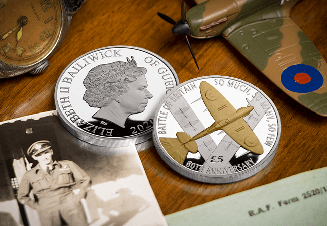
The iconic Supermarine Spitfire was critical in defeating Luftwaffe air attacks during the Battle of Britain in 1940, and so to mark the 80th anniversary this year, I knew we had to arrange something unique to produce a truly special collectable coin worthy of the historic anniversary.
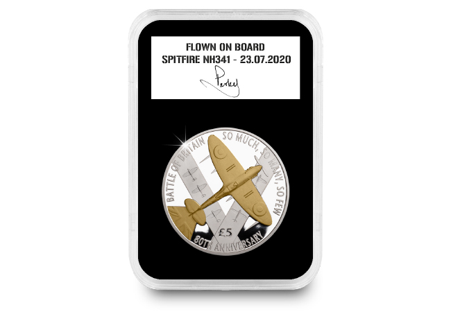
So on the 23rd July I drove up to the historic Duxford Aerodrome to have 1,000 brand new Proof £5 coins flown in an original WWII Spitfire.

Now the purpose of my visit was to have 1,000 Official Battle of Britain £5 coins flown in an original WWII Spitfire, but I was also able to talk to RAF Flight Lieutenant Antony ‘Parky’ Parkinson in great detail about his time in the RAF and as an ex-Red Arrow ahead of the Battle of Britain anniversary. You can see Parky discussing his career and the Spitfire in the video below…
Before Parky took the ‘NH341’ Spitfire to the air, I helped him secure the 1,000 Battle of Britain Spitfire £5 coins into the wing bays which would have once held the fighter plane’s armaments while defending Britain in the skies 80 years ago. The space in the wing bays is extremely limited, hence the limited number of coins that were able to be taken to the sky.
Standing within a few feet as the famous Rolls Royce engine fired up, I watched in awe as the elegant, agile aircraft taxied along the runaway and gracefully took to the skies.
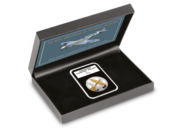
Although many 80th anniversary plans up and down the country have had to be cancelled, I am delighted to be able to give a limited number of collectors the opportunity to become the proud owner of the BRAND NEW Official Proof £5 coin that has been flown in an original WWII Spitfire plane. But that’s not all, as I was also able to arrange for them to be personally hand-signed by Parky.
The brand new Spitfire £5 coin is a fantastic commemoration of the famous plane and I am grateful that I had the opportunity to mark the 80th anniversary of the Battle of Britain with such a fitting tribute.
So I’m sure you can appreciate what a genuinely rare collectable these will instantly become and demand is expected to exceed availability. If you wish to secure one for your collection, you need to act quickly by clicking here.
Thank you to Flight Lieutenant Antony Parkinson MBE and the rest of the team at Aerolegends for helping to take the Spitfire £5 coins to the sky and for giving me the opportunity to see this famous warbird in the flesh.
If you’re interested, you’ll need to be quick as over 50% have already been reserved. You can secure the Official Battle of Britain Proof £5 coin now for JUST £35 by clicking here >>
And remember, not only will your official Battle of Britain £5 Proof coin have been flown in an original WWII Spitfire, it is also one of just 1,000 coins that have been personally signed by Lieutenant Antony Parkinson ‘Parky’, MBE.
The game is afoot – BRAND NEW Royal Mail Sherlock stamps announced
Royal Mail have just announced the release of BRAND NEW Sherlock stamps, to celebrate the 10th anniversary of the popular BBC TV Series.
The stamps will be officially released on 18th August 2020 and feature the most iconic and best-loved characters including Holmes, Watson, and Moriarty – whilst the exclusive ‘Mysteries of Sir Arthur Conan Doyle’ Miniature Sheet features four of the author’s favourite Sherlock Holmes stories.
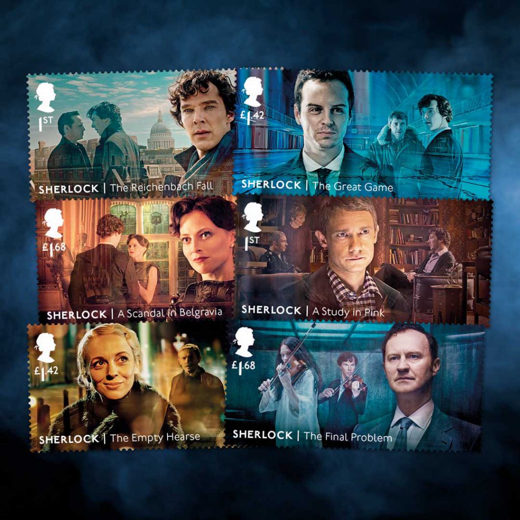
Here’s your guide to the most collectable versions of the new Sherlock stamps…
The UK 50p Coin Cover
This UK 50p Coin Cover perfectly combines the complete set of BRAND NEW Sherlock Stamps and Miniature Sheet with The Royal Mint’s UK Sherlock Holmes™ 50p Coin.
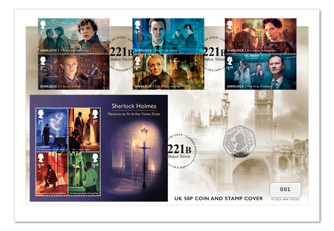
Significantly, JUST 1,000 Sherlock Holmes UK 50p Coin Covers are being released nationwide, making this one of the most limited ways to own these sought-after stamps and 50p coin.
The Framed Edition
The Framed Edition of the NEW Sherlock stamps features Royal Mail’s official Collector Sheet, and is one of just 2,995 that will ever be issued.
The Framed Edition includes all six new characters stamps, as well as ten EXCLUSIVE Philatelic Labels featuring iconic scenes from the show.
The Definitive Edition
What sets the Definitive Edition apart from all other issues, are the stamps. You see, this edition comprises EVERY official Royal Mail Sherlock stamp ever released, from the complete set of ten NEW Sherlock Stamps, to the extremely sought-after 1993 issue.
The Definitive Edition is strictly limited to JUST 495 and will come professionally mounted and framed, ready to display in your home or office.
The Ultimate Edition
What makes the Ultimate Edition ‘ultimate’ is the fact that is comprises BOTH official Royal Mail First Day Covers alongside the stamps’ official release notes – and has been professionally mounted and framed, ready for you display in your home or office.
A MUST-HAVE piece of memorabilia for any fan, the Ultimate Edition is strictly limited to JUST 495 sets worldwide…
If you’re interested…
You can own one of the special Sherlock Holmes Stamps Editions today, click here to view the full range.

