Posts Tagged ‘pink floyd album’
Pink Floyd’s ‘The Dark Side of the Moon’: The Story behind the design
It is often touted as the best album of all time, and has become so ingrained as part of popular culture that it’s hard to believe that the concept for Pink Floyd’s The Dark Side of the Moon cover was actually born out of a simple textbook illustration.
We were lucky enough to have the album’s original illustrator, George Hardie, visit us at our offices where we chatted about the album.
Perhaps unsurprisingly, the iconic design has its routes in a chance 1968 meeting in a photographic darkroom at the Royal College of Art in London. It was then that George first met Storm Thorgerson and Aubrey Powell – the creative minds behind now legendary design studio, Hipgnosis.
Over the year, Hipgnosis produced artwork for some of the most influential bands of the era including Led Zeppelin, Genesis and Black Sabbath, but it was the bold graphic design for The Dark Side of the Moon which thrust the studio’s work into the public eye when it hit record stores in March 1973.
Until this point, much of Hipgnosis’ work had been photographic. But under the direction of Pink Floyd’s keyboardist Richard Wright to produce something “simple, clinical and precise” their ideas took on a new dimension. The breakthrough moment was provided by Storm Thorgerson who remembered an illustration from a photography book showing the process of light refraction through a glass prism; “An inspirational image in itself” as George recalls. The concept seemed particularly fitting for Pink Floyd who were famous for their use of light shows.
“Slightly re-arranging the illustration, I drew a line artwork and indicated colours using percentages of magenta, cyan, yellow and black from a printer’s chart – the simplest way of making this kind of line artwork where the lines act as the edges of each colour and the printer fills in the colours.” explains Hardie. The prism was airbrushed, black on white, and reversed out of a mechanical printer’s black background to produce the final effect.
After its release, The Dark Side of the Moon went to number one on the US Billboard chart for one week, but it ended up staying in the charts for a consecutive 741 weeks from 1973 to 1988 – longer than any other album in history.
The band were suddenly propelled from the underground into the mainstream. With an estimated 45 million copies sold, it became Pink Floyd’s most commercially successful album and is frequently ranked as one of the greatest rock albums of all time. The white beam of light passing through a prism to form the bright colours of the spectrum against a stunning black background invited listeners to discover the music inside, and it still does today.
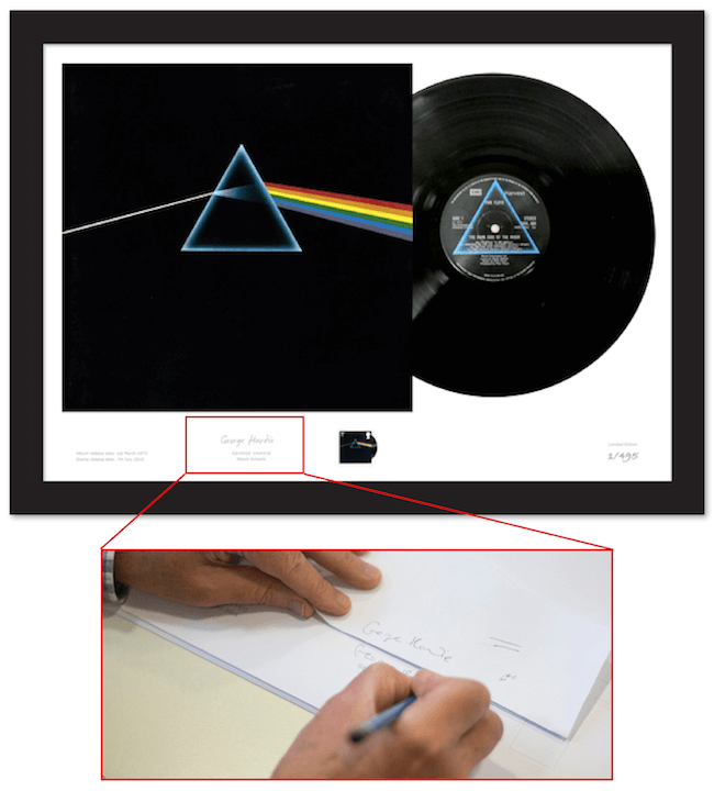
Own the Dark Side of the Moon Framed Edition
Now you can own this definitive piece of Pink Floyd memorabilia – a remastered copy of The Dark Side of the Moon vinyl professionally framed and signed by the original album artist, George Hardie himself.


